ROLE
Designer
DURATION
4 weeks
TOOLS
Adobe Illustrator, Adobe Photoshop, Figma
OVERVIEW
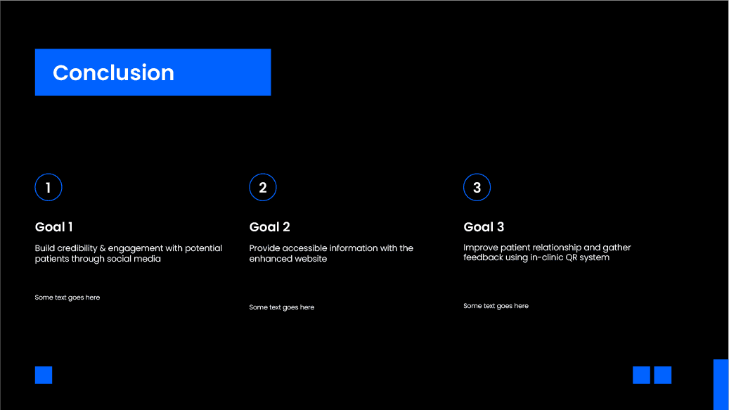
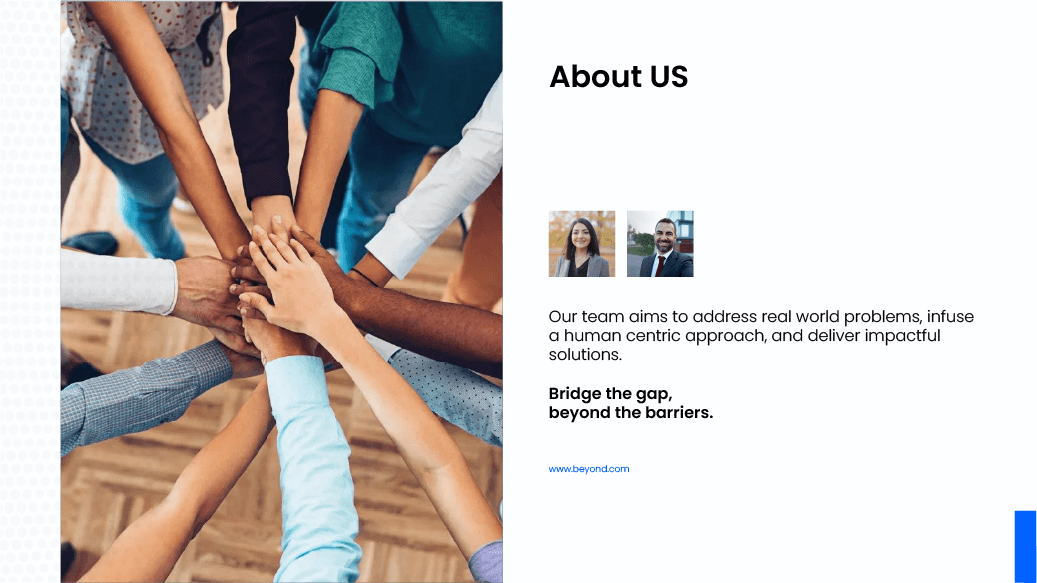
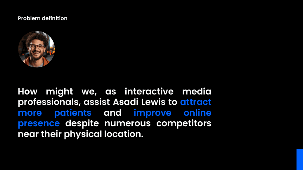
In this project, I, along with a group of four, developed the brand identity for "Beyond," a movement that transcends physical boundaries to bridge the gap among communities, businesses, and ideas. My branding approach emphasized a human-centric design, infusing creativity and innovation to foster meaningful connections. I crafted a narrative that highlights Beyond's commitment to limitless creativity, emphasizing the importance of action as the bridge between ideas and results. By focusing on result-based and analytical data, I ensured that Beyond's promise of delivering consistent results was at the core of the brand. Additionally, I integrated the concept of impact, showcasing how Beyond involves clients in making a positive difference for their target audience through problem-solving and inspiring change. This comprehensive branding strategy not only defines Beyond's identity but also empowers its clients to achieve their goals and make a lasting impact.
IDEATION
The ideation process for Beyond began with the goal of creating a brand that brings people, ideas, and communities closer together. We wanted to develop an identity that goes beyond traditional boundaries and reflects a spirit of connection and collaboration.
We asked ourselves key questions during this process.
How can the brand encourage meaningful interactions between people and businesses?
What can we do to ensure the brand stays relevant and adaptable while maintaining a clear identity?
How do we foster a sense of inclusivity and purpose in every aspect of the brand?
MISSION & VISION
LOGO
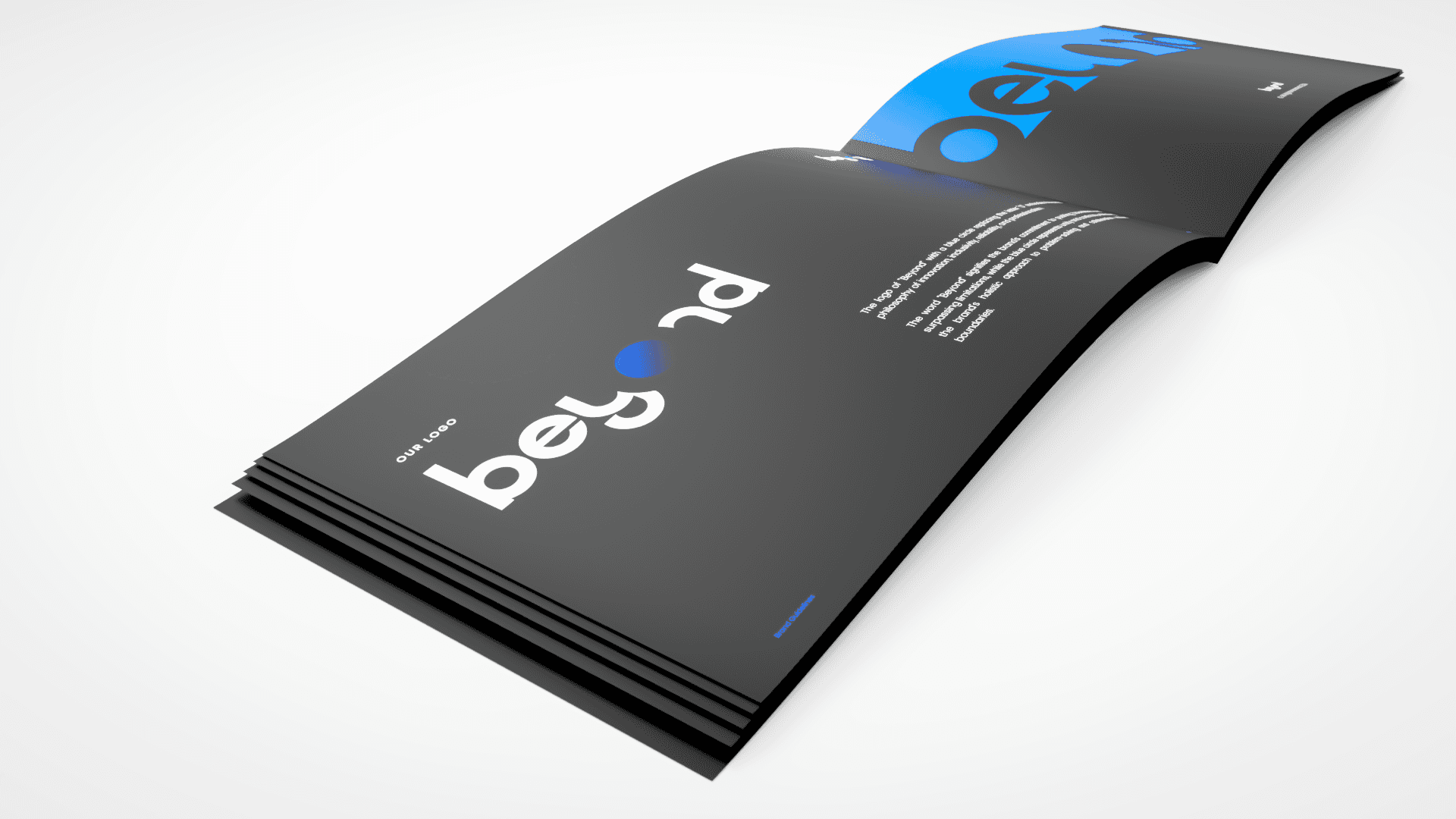
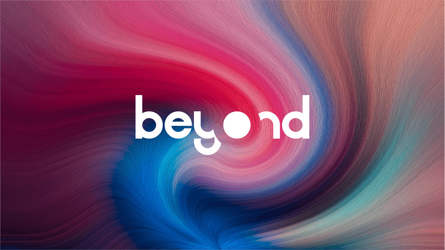
The logo of "Beyond" with a blue circle replacing the letter "O" embodies Beyond's philosophy of innovation, inclusivity, reliability, and professionalism. The word "Beyond" signifies the brand's commitment to pushing boundaries and surpassing limitations, while the blue circle represents unity and continuity, reflecting the brand's holistic approach to problem-solving and collaboration without boundaries.
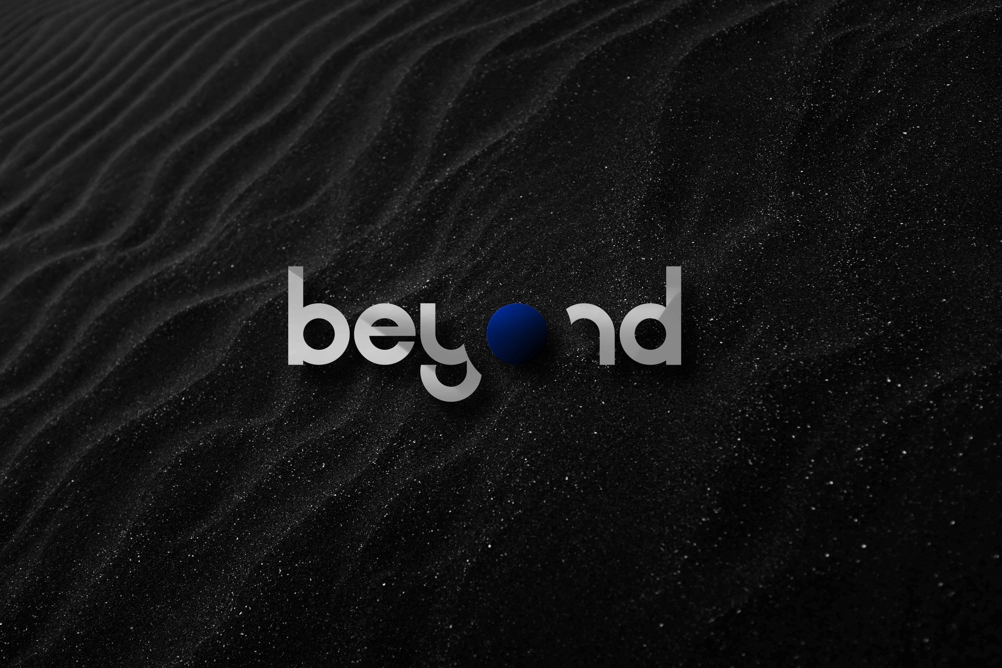
Colour Variations
COLOUR PALETTE
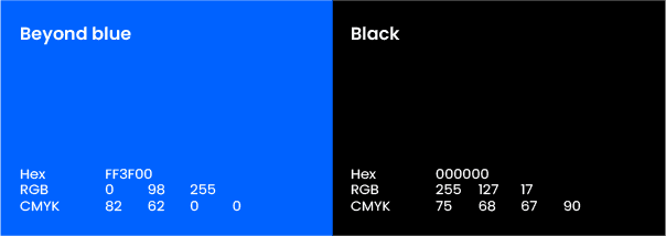
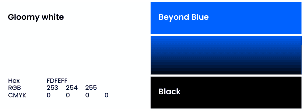
As a general rule, any colour specified in the primary palette can be used as an accent colour when white is the background. All corporate material should primarily use the primary color palette.
FONT & TYPOGRAPHY

Poppin Sans for typography perfectly encapsulates Beyond’s brand identity and values. Its modern, approachable aesthetic, combined with exceptional readability and versatility, ensures effective communication of the brand's messaging across various platforms. With a contemporary feel and emphasis on accessibility, Poppin Sans reflects the brand's commitment to inclusivity and innovation, while its clean and minimalistic design reinforces Beyond’s image as a forward-thinking and sophisticated global creative agency.
BRAND GUIDELINE
